Problem Description:
The R programming assignment explores statistical analysis and distribution characteristics related to the filling of juice boxes. The questions delve into understanding the impact of standard deviation and mean on the distribution of juice levels in the boxes. Additionally, the assignment involves the examination of histograms, box plots, QQ plots, and summary statistics to conclude the uniformity and normality of the distributions.
Question 1: Distribution and Standard Deviation
Problem: Investigate the influence of standard deviation on the distribution of juice levels in boxes. Analyze how changes in standard deviation and mean impact the percentage of underfilled juice.
- As the standard deviation (SD) increases, the distribution peak decreases and the curve widens at the base. The percentage of underfilled juice decreases as SD increases.
- At a mean of 135ml and SD of 15ml, the percentage underfilled is 2.5%, 3.5% at 10ml, and 4.5% at 5ml. Lowering the standard deviation increases the percentage underfilled.
- With a constant SD of 5ml, as the mean increases (130ml to 140ml), the percentage underfilled decreases. Increasing the mean at a constant SD decreases the underfilled percentage.
Question 2: Histogram and Box Plot Analysis
Problem: Examine the distribution of juice levels using histograms and box plots. Evaluate the company's claim of slight overfilling and identify any outliers.
- The histogram shows a nearly uniform distribution, supporting the company's claim of slight overfilling.
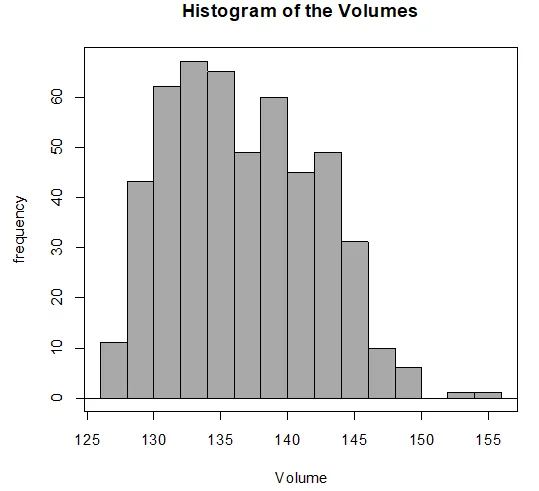
Chart 1: Histogram showing uniform distribution of frequency and volume
- There is an outlier, confirmed by the box plot. Mean (136.7) slightly exceeds the median (136.2), aligning with the outlier on the left.
- Summary statistics reveal a narrow interquartile range (8.5), indicating most observations are within the 25th and 75th percentiles.
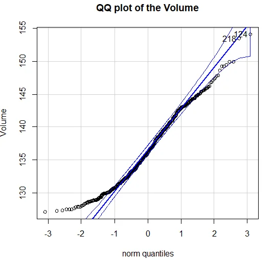
Chart 2: The QQ plot of volume vs. norm quantiles
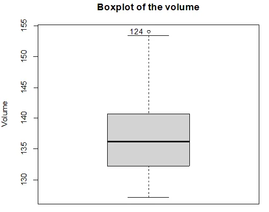
Chart 3: The box plot of volume in histogram
Question 3: Normal Distribution Assessment
Problem: Explore the normality of juice level distribution. Analyze histograms, QQ plots, and box plots to assess skewness and spread in comparison to question 2.
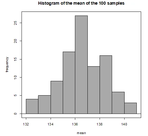
Chart 4: 100 samples showing the uniformity of frequency and mean
- The histogram displays a normally distributed shape, in contrast to the uniform distribution in question 2. Slight left skewness is observed.
- QQ plot and box plot confirm normality with less spread than question 2. A single outlier is observed.
- Summary statistics of 100 means indicate a mean of 136.5954 and SD of 1.87001.
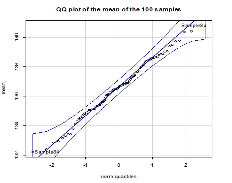
Chart 5: QQ mean of the plot on 100 samples
Question 4: Comparing Distributions
Problem: Compare distributions from question 3 with a new distribution. Assess normality and spread using histograms and summary statistics.
- Histogram analysis shows a normally distributed curve with the narrowest base among the three distributions.
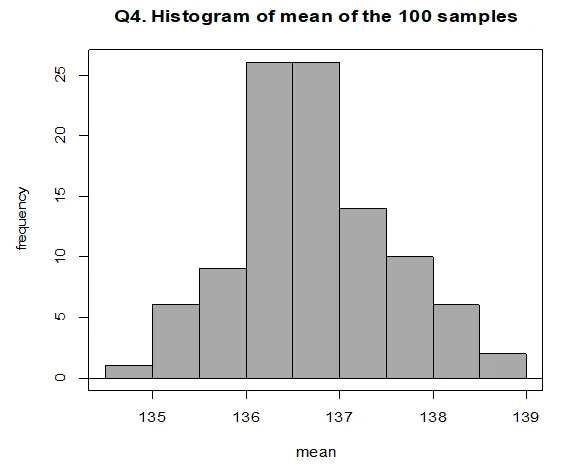
Chart 6: Histogram of the mean of 100 samples
- The narrowest base signifies the least spread; the distribution is normal with no skewness.
- Summary statistics indicate a mean of 136.7228 and SD of 0.8253212, supporting a narrower spread compared to question 3.